
by Contributor

(Oct. 26, 2021) — Visualizing your company data with maps is a great way to make it easier for people to understand. Maps are an excellent tool for communicating through visuals. They simplify complex information by highlighting the most important data points to help readers quickly grasp what they need to know about a subject without extensive training or experience. This article will cover how you can utilize maps as a visual aid in presentations, team meetings, and strategic planning sessions.
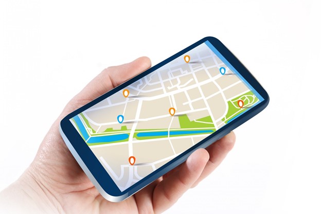
- What Is A Map Visualization

Maps are geographical representations of the world, our country, or even your local neighbourhood. They can be used to display all types of data in a way that makes it much clearer to see if the data is clustered in one area or distributed across different parts of the map. Map visualization can be made in almost any presentation software, including PowerPoint and Google Slides. Many free tools exist that will allow you to easily create maps for use in presentations, team meetings, and strategic planning sessions. These include showmymap.com, which uses the Google Maps API to geocode points on your map, so they centre around the location where they were recorded. Other examples include Tableau Public, Microsoft Power BI Desktop, GeoCommons, Sisense, and Datawrapper.
2. Benefits Of Using Maps To Visualize Data

There are several benefits to using maps in your data presentations. One of the most obvious is that it can help you quickly convey information about where events have occurred, often with just a glance. Maps also allow you to do some more subtle things with data visualization, such as communicating relative sizes and locations. For example, if five points on your map are clustered together near the top left corner, this may imply that those events represent a small part of one large city or district. Hundreds of thousands of points scattered across the entire map could suggest that there were many locations used for gathering data – possibly even all over the world – and not enough time was spent analyzing each one individually to pinpoint certain causes for specific regions.
3. Improve Marketing Efforts
Companies can use mapping tools to improve how they market the same products and services. For example, a makeup company might find it’s more effective to focus on promoting its nail polish line in states with warmer climates rather than ones that are colder. By adding heat maps showing different regions of the country and overlaying them with demographic data about their customers, you can identify which states to target individual products at.
4. Improve Internal Operations
Internal operations can be a major source of cost and inefficiency for many companies. This is especially true in the case if they have too few resources per geographical area. For example, a company that is just starting up may only have one sales representative who’s responsible for northern California. Using mapping tools, it would be easy to tell that this resource isn’t enough or where you should bias your attention based on their location. The same goes with any other type of business- whether it’s managing inventory, making deliveries or deploying staff-it’ll be easier to help your organization be more efficient using mapping tools.
5. Track Shipments & Deliveries
One of the most common uses for showing data on a map is using it for shipments and deliveries. In today’s world of e-commerce, companies are making thousands of transactions every day across the country. A company could have their resources planning out deliveries or tracking packages from one location to another to avoid any problems with shipping costs or even items being returned because they weren’t delivered on time. This can be made easier by making a heat map that shows how many shipments were made in a certain area over a certain period which can help you decide if your resources should be more focused on different areas or optimize routes based on the most popular places where items were being delivered.
It will also be an easy task to create an optimized route if you need something quickly done, as there’s no faster way than to find the shortest distance between two points.
Another example where you could use this technology is for medical purposes.
For instance, if you are a doctor who needs to get medical supplies from warehouse A to another building on campus, you can see how many deliveries were actually made on time without any delays or problems by looking at which routes are most travelled and making sure your team gets there in time. This way makes it easier for them to tell when they need more people on specific routes instead of taking twice as long to go through all the delivery stops only because the truck would be empty at every other stop. At the same time, some areas struggle with getting their shipments delivered. This also allows doctors to plan ahead of their day, knowing that they have more urgent appointments in the morning and can focus more on them than spending 8 hours making back-to-back appointments.
6. Dive Deeper With Heat Maps
Heatmaps are one of the most popular ways of visualizing your data with maps. They’re also very easy to create, no matter how many points or locations you have. All you need is the latitude and longitude coordinates of all your locations so that Google can plot each location on their map for you. When it comes to colours, various options work really well when illustrating with heatmaps, which mainly depend on your intensity threshold (for example, how low temperatures need to be at specific locations before they turn red).
When it comes to clustering data, Show My Map offers some exciting options like using polygons (bounding box) or drawing shapes dynamically on the map. There are various types of polygons to choose from, so you can pick one which looks best for your data set. Drawing dynamically works excellently with the dynamic routing point to point option, illustrating your company locations with routes on the map. You can route between all of them, only within a certain distance or only between two specific locations (key features).
Conclusion: Maps have always been a great way to illustrate data. Make sure you explore different map creation tools and visualize your company’s data to the best of your ability.